iSECURE SCREENS & SHUTTERS.

Brief:
iSecure Screens & Shutters needed a bold and modern brand identity to communicate their commitment to quality, security, and style. Operating in an industry dominated by long-established businesses with dated, traditional logos, the challenge was to design a fresh, contemporary visual identity that would stand out, build trust, and appeal to design-conscious homeowners.
Solution:
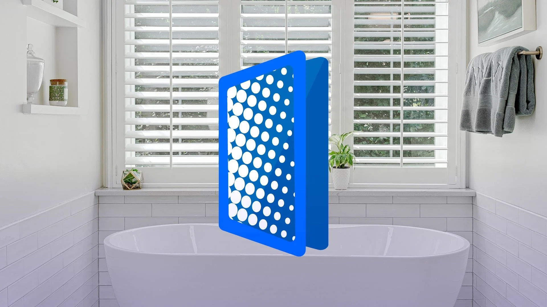
The brand was crafted with a modern aesthetic to clearly differentiate iSecure from competitors. At its core is a strong yet simple icon of a security screen door, symbolizing safety, strength, and clarity. Clean, sans serif typography ensures the brand name is legible and contemporary, helping the business project reliability without feeling old-fashioned. The design approach was intentional: to feel trustworthy and robust while visually breaking away from the clutter of outdated industry branding. The identity was rolled out consistently across marketing materials, vehicle wraps, staff uniforms, and other key touchpoints to establish a professional and unified brand presence.
Outcome:
The result is a clean, forward-looking brand that positions iSecure Screens & Shutters as a modern leader in the security space. It successfully sets the company apart in a crowded market, giving it a distinctive voice and appearance that resonates with today’s homeowners. The branding reinforces iSecure’s role not just as a service provider, but as a trusted partner in protecting and enhancing the look and feel of Australian homes.


